
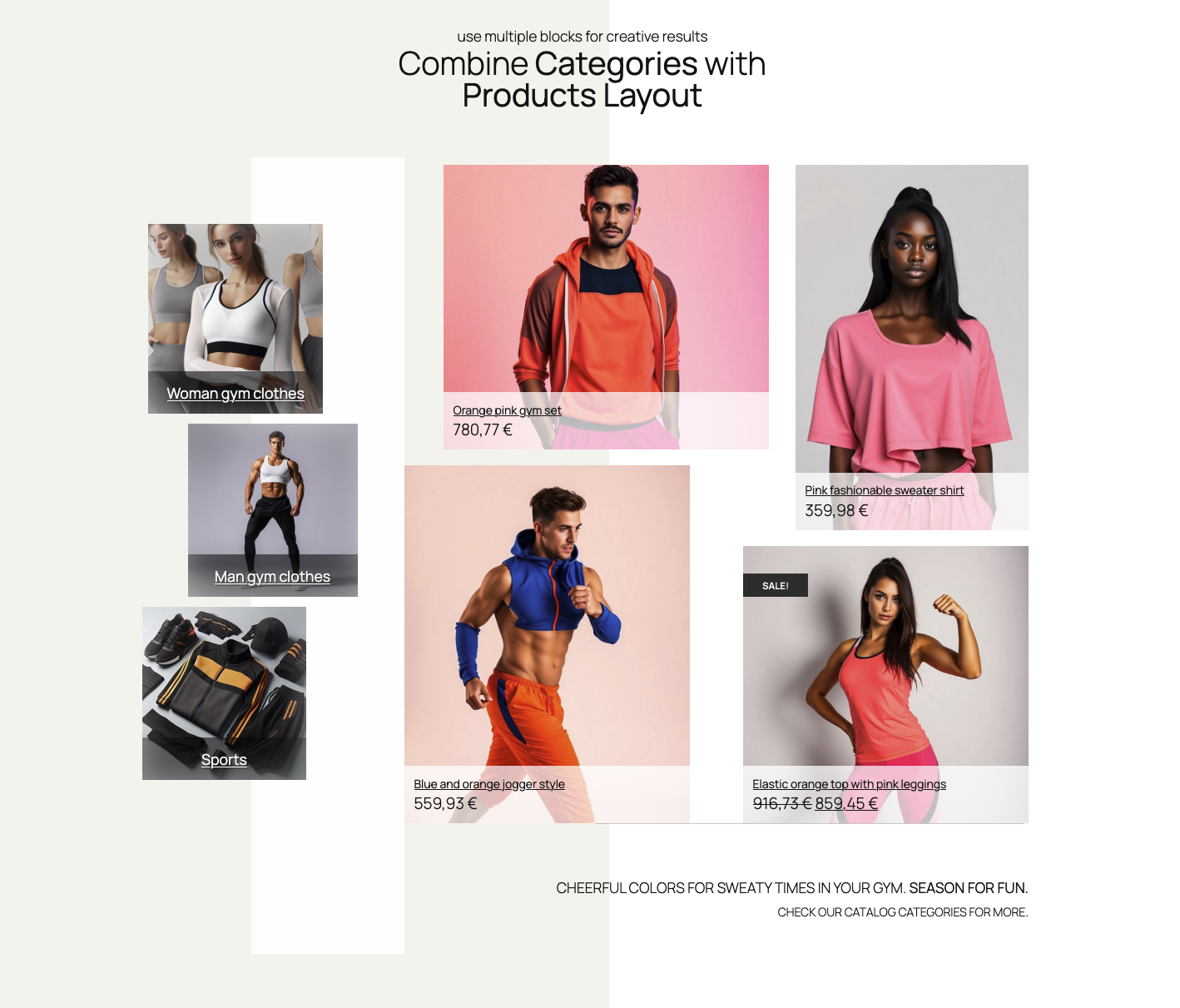
Basic Categories Layout block example
Intro
With the “Single product layout” block you can create unlimited custom single product layouts.
Product selection
Once the Single Product Layout block is added to a page, popup modal will automatically offer a selection of products. If you decide to replace the product, you can use the product selector. It is available in the Inspector controls sidebar or block controls. You can see this in the image below.

Starter layouts and styles
When the Single Product Layout block is added to a page, it will already have a basic layout and style.
Starter layouts and styles can be selected in the Inspector Controls in the right sidebar, or in the block controls (images bellow):


You will notice that colors and other styles are changing when switching the starter layouts. Unlike the Products Layout block, the Single Product block unifies the starter layout and styles in one control.
NOTE: Any added item or changed layout will be overwritten if you switch starter layouts after the edits.
Editing layout
After the starter layout is chosen, elements (product title, price, image etc.) in layout can be rearranged, resized, added, or removed. It’s enough to hover the item, and the resizing or moving handles will show up, enabling handling the item.
Move and resize items
Rearranging the layout is straightforward. When a product element is hovered, the handles for resizing the item will show up. The element container will resize by dragging the handles.
You can move elements to any position. Simply drag and drop item when the cursor is set to the hand icon.
Notice how each element has outline with labels, appearing on block hover. These outline serve as a helping tool for easier placement and resizing of elements. Outline and labels appear only when editing the product layout. They will show if you select either “On block hover” or “Always” as options. You can find these options in “Layout and grid settings” > “Helper outline and labels” within the Inspector controls sidebar.
Grouping elements
Product elements can also be grouped in a special, group item. You can add this from the Block controls toolbar by clicking on “Add group“. Each group element has a control to add title, price, or other elements into a group. A control appears on group element hover, and opens a popover with elements to add.
When an element is added to a group, it is removed from the main layout. Conversely, when it is removed from the group, the element returns to the main layout.:
When more groups are added, elements can switch their positions between groups. They can also be “returned” back to the main layout. Other controls include Remove (or delete) group button, and a elements sorting and visibility control:


Each group element can be styled in sidebar Inspector > Product style settings, where other elements styling can be done. Elements in group can change styles the same way as when they are outside the group element.
Block controls toolbar
As any other block, the “Single product layout” has a block controls toolbar when the block is selected. Block controls toolbar includes the following controls:
- Block alignment (editor default)
- Device preview control
- Layouts and styles control
- Elements visibility per device
- Elements z-index control (for stacking elements bellow or above)
- Add/Change product control
- Add group element control


The “Z-index” control will place an element in front or behind other items. This setting appears only if “Allow overlapping items” in “Grid settings” sidebar section.
Product style settings
Controls are contextual, depending on type of element (text, image, button …). For example, each textual element (title, price, short description) has font size, color, shadow, and alignment controls
In “Product style settings” sidebar section there are controls for changing visual aspects of product elements. Style controls are grouped under elements (title, price, etc.), within the popup modal which appears when clicked on element name.

To make editing element styles experience easier, every element’s container style can be copied and pasted between the elements. Each element has it’s container, and container style settings, like border, padding, background color, can be shared between containers.
To adhere to the principles of intrinsic web design, controls for font sizes, padding, and spacing are fluid. This choice for controls avoids excessive settings for various devices. Font, padding, or spacing size will adapt and stretch to size between the least and highest size, in rem units.
Bulk editing styles for elements
To change styling properties of multiple elements, use the “Bulk edit styles for elements” control. This allows shared properties like container padding, text color, and background to be changed for all elements. You can also modify the border, box shadow, or alignment of all elements.
Not every style setting will apply to every element. For example, padding won’t apply to image. Use the “Product style settings per element” section to change individual element style.

Elements Visibility
Every product element has controls over visibility on devices (desktop, tablet, mobile). To change element visibility, go to Inspector sidebar > Product style settings > Elements visibility and click on devices icons to toggle visibility, per device (desktop, tablet, and mobile)

Saving layout and style sets
A powerful tool for quickly changing the look of your products is the Saving layout and style setups section.
This utility allows you to save as many setups as you want to the database. This means those setups can be reused in any other Mosaic Products Grid block instances.
NOTE: Saved setups can only be used within block instances of the same type. Saved Single product Setups can’t be applied to Product Layouts or Category Layouts blocks.
Layout grid settings
The base for creating Categories Layout is a grid system which controls the placement of product items. Grid enables easy snapping and aligning items, even for more free and creative layouts.
Grid layout settings includes controls for row grid height, and a grid spacing. Both settings affect the layout size). Extra settings are grid helpers – a visual aids for easier layout editing.
If set, Grid helper will show a grid in front, or behind elements. Helper outline and labels can help recognize elements in a layout.