


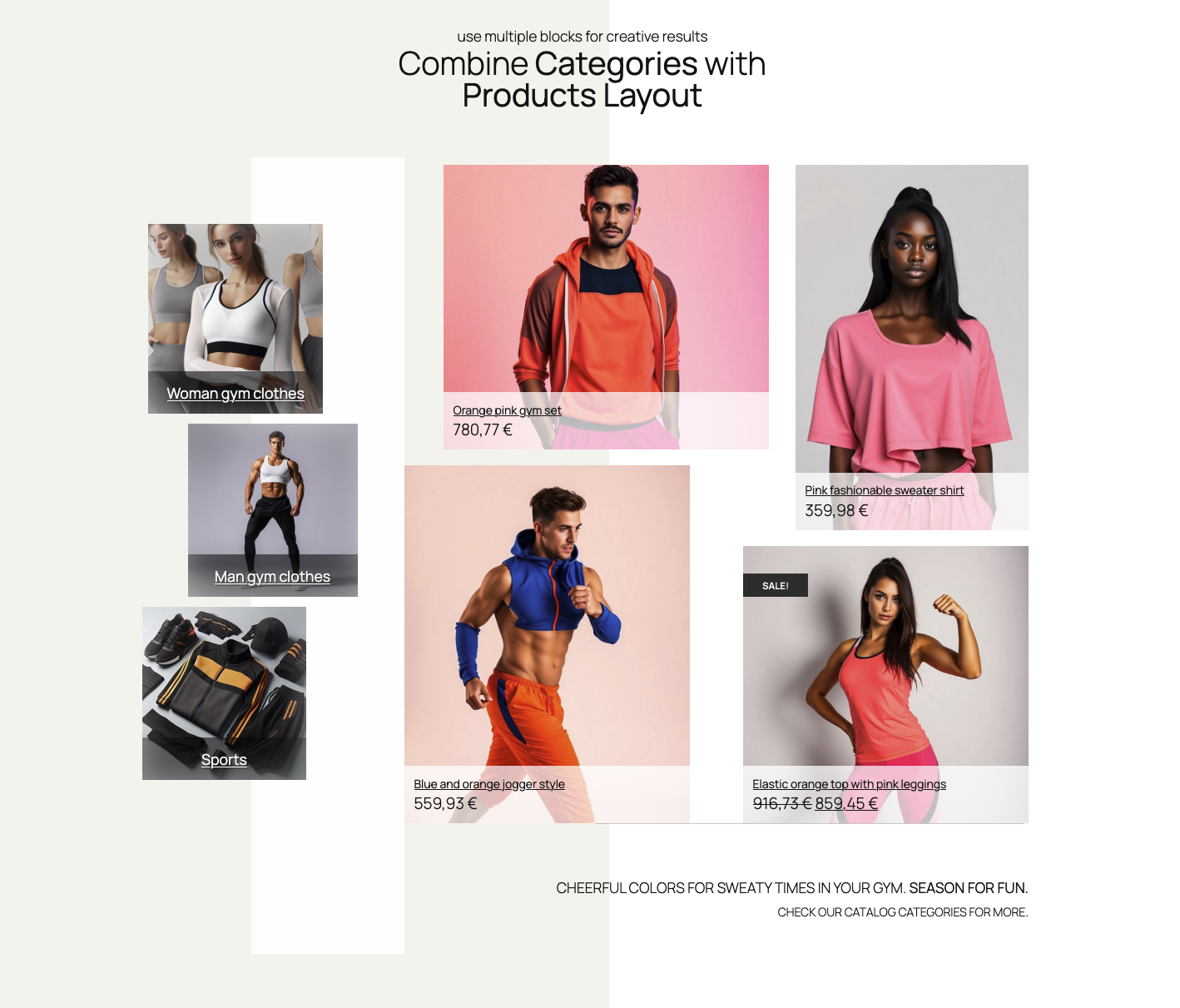
Simple Products Layout block example
Products selection
Products can be chosen in two ways. One choice is automatic selection, which shows products based on query settings like ordering and filtering by categories. The other option is to hand-pick particular products. In Inspector Control sidebar, open “Products” section to choose your preferred product selection.
Automatic (query based) products
Query based product selection lets you set up products based on several criteria. These include products belonging to one or more categories. It also involves ordering criteria, such as displaying new or old products first. Another option is to order products by title, either descending or ascending. If, under the “Products” sidebar section, you choose a “Automatic” option, the ordering and categories options will display:


Ordering and category options can be merged. For example, you can choose to show best selling products from a certain category.
Hand-picked products
The other choice is to hand pick product to create completely customized Products Layout. Products can be selected in Inspector Controls sidebar (after you choose “Hand picked” instead of “Automatic”) , or in each layout item, by clicking on + button:

NOTE: if a product is deleted, it will be missing from the layout. Also, if product ID is changed, it won’t have any fallback product displayed. Use hand-picked product choice for regularly curated layouts.
Starter layouts
When Products Layout block is added to a page via block inserter, it will already have a basic layout. This layout includes 3 items in a row. It also has a default style, as seen in the example from the top of this page.
Starter layouts can be selected in the Inspector Controls in the right sidebar, or in the block controls:


These layouts are simply a starting points to kick start your layout creation. Layouts are created with 3 or 4 items in various layout configurations.
NOTE: Any added item or changed layout will be overwritten if you switch starter layouts after the edits.
Starter styles
Like Starter layouts, Starter styles serves as a kick-starter for styling products. We predefined the styles for the most common visual styling. Use starter styles as starting point, and apply your style changes to fit your desired preference.


NOTE: Like starter layouts control, switching starter styles will overwrite any style changes made in the “Product styles” section
Editing layout
After the starter layout is chosen, items in layout can be rearranged, resized, added, or removed. It’s enough to hover the item, and the resizing or moving handles will show up, enabling handling the item.
Adding or removing layout items
To add items, click on “Add grid item” in block controls. Alternatively, use the Inspector Controls sidebar and navigate to Grid settings, then click on Add grid item.
Removing items can be done by clicking on red “X” on each item (when hovered):


Move and resize items
Rearranging the layout is straightforward. When a product item is hovered, the handles for resizing the item will show up. Item will resize by dragging the handles.
You can move items to any position. Simply drag and drop item when the cursor is set to the move icon.
Item toolbar
Each item has a small toolbar, appearing on item hover. The toolbar’s content depends on the type of product query, whether automatic or hand-picked. It also depends on the grid settings, like “Allow overlapping items” (more about “Grid settings” section bellow). The toolbar holds z-index control and hand-picking product control. There is also the option to remove the item from the layout. It includes the item id info.

The “Z-index” control will place the item in front or behind other items. This setting appears only if “Allow overlapping items” in “Layout and grid settings” sidebar section.
Edit the product style
In “Product style settings” sidebar section there are controls for changing visual aspects of products. Font sizes and colors, spacing, alignments, backgrounds, borders, shadows, and visibility per devices, and product elements ordering. There are also a couple of special controls. These include product short description number of lines (truncating). They also cover rating stars size and sale badge appearance. Custom “Add to Cart” button styles and featured image resolution are also included.
More about customizing “Add to Cart” here.
Text sizes, shadows …
The first tab in “Product style settings” covers text sizes. It includes the product title, price, short description (or excerpt), categories, and “Add to cart” button.
To adhere to the principles of intrinsic web design, font sizes are fluid. This choice avoids excessive settings for various devices. Font size will adapt and stretch to size between the least and greatest size, in rem units.
With the “Truncate short desc.” and “Truncate lines” the short description can be shorten, given the number of lines.
Text shadows are useful for better visuals, and to improve readability.
Layout, alignment, spacing
The second tab in “Product style settings” is related to product layout styles:
“Product layout type” drop-down provides several options. You can place the product image on the left, right, top, or bottom. Alternatively, use product image as a product background image.
Horizontal and vertical align buttons will align product elements compared to each product container box.
Padding and elements spacing controls use a fluid size system. This system sets the minimum and maximum values, (according to the intrinsic web design principles). Padding applies to product content box, elements spacing applies to product elements (title, price, short description …).
Two extra controls in the layout tab are the “Rating stars size” and the “Image size“. The “Rating stars size” control will apply if the product has ratings. Also, the visibility must be set in the last tab, “Product elements visibility and sorting”.
The “Image size” resizes the product image in percentages, compared to product content box.
Element colors
The third tab in “Product style settings” holds controls for font and background controls. If (product image) overlay color is set, the overlay opacity can be controlled. Additionally, background color controls includes the gradient colors choice. The “Overlay blend mode” can change the overlay blending with the image, giving special visual style to image.
Border and shadows
Fourth tab holds settings for product box container border and shadows. Border settings include width, color, and style, as well as border radius (“Rounded corners” setting).
The box shadow can add shadow to product container box, and it also includes inset shadow.
Sale badge settings
The sale badge is a product element which appearance depends on whether the product is on sale. It also depends on whether the visibility is set, in the “Visibility and sorting” tab.
The Sale badge settings include the background color, position (top / left), and the badge shape. When changing the badge background color, the font color will automatically change for the best visibility contrast.
Positioning sale badge is determined with the percentage from the top and left side of product content box.
The Sale badge shape options are square, circle, rounded, tag, and starburst.
Visibility and sorting
The last tab in “Product style settings” deals with product element visibility and sorting. Visibility can be toggled per device (desktop, tablet, or mobile). Sorting elements can be done using drag and drop handle with the up/down arrows.
Additional settings
There are two extra settings for the product: the “Add to Cart” button style classes and the Product image resolution.
The “Custom Add to Cart” toggle changes the style of the “Add to cart” button from the block’s style. It can be toggled to use theme, WooCommerce, or custom CSS class names. When “Custom classes” is toggled on, a choice of commonly used classes is offered. This helps match the button style to the rest of WooCommerce styling or theme styling.

The “Product image resolution” sets the product image quality. The “Automatic” setting is recommended as it uses the “srcset” image HTML attribute with responsive image sizes.
Style settings per item
Each item in the “Products Layout” block can have its own style, which overrides general style settings.
In the “Style settings per item” click the toggle “Override settings” to enable styling controls for that item. The controls per item are the same as for the product style settings in general (the “Product style settings” section).
NOTE: If many items are added to the grid, it can get complicated. Each item having its own custom styling contributes to this complexity. Thus, we recommend using styling per item sparingly.
When style override for is activated, the default style will apply to that item.
To match the current general style, use the “Apply current global settings”, available in the copy/paste toolbar. More info bellow:

Additionally, item override includes Style switcher. It allows starting with predefined styles. There is also a copy/paste mini-toolbar to copy and paste styles between general and item styles overrides.
Style copy/paste
We have added a small utility tool for copying and pasting styles. You can copy styles from general style settings to individual item or vice-versa. It is also possible to copy styles temporarily to easily switch back to the last satisfying style.
You can find the copy/paste toolbar above the “Product style settings” tabs. It is also available in each item style tab in “Style settings per item“.
As mentioned above, to apply the current general style settings, each item has additional toolbar button “Apply current global settings“.


Saving layout and style sets
A powerful tool for quickly changing the look of your products is the Saving layout and style setups section.
This utility lets you save as many setups as you want to the database. This means those setups can be reused in any other Products Layout block instance.
NOTE: Saved setups can only be used within block instances of the same type. You cannot apply saved Products Layout setups to Categories Layout or Single Product Builder blocks.
Layout grid settings
The base for creating Products Layout block is a grid system which controls the placement of product items. Grid enables easy snapping and aligning items, even for more free and creative layouts.
Grid layout settings controls grid row height, grid spacing (affects products spacing), items overlapping toggle, and items compaction type. It also includes a grid helper – a visual aid for easier layout editing.
Compaction type will make items “gravitate” to the top or to the left side. This depends on whether horizontal or vertical compaction type is selected. Compaction will also allow space between the item only for the set margin size.