Your products deserve more than rows and columns. Discover how modern WooCommerce stores are breaking free from boring layouts.
Every WooCommerce store starts the same way. You install a theme, add your products, and there they are—sitting in a perfectly symmetrical grid. Three columns. Four columns. Maybe five if you’re feeling adventurous.
But here’s the uncomfortable truth: your store looks exactly like thousands of others.
In a world where customers make snap judgments in milliseconds, a generic product grid isn’t just boring—it’s costing you sales.
The Problem: Every Store Looks the Same
Open ten WooCommerce stores in different tabs. Chances are, you’ll see the same layout repeated over and over:
- Products arranged in rigid rows
- Identical image sizes for every item
- No visual hierarchy to guide the eye
- Zero personality or brand differentiation
This isn’t a failure of imagination. It’s a limitation of tools.
Most WooCommerce product blocks and page builders force you into predetermined structures. Want to make your bestseller twice as large as other products? You’ll need custom CSS. Want products to overlap for a magazine-style look? Good luck finding that option.
What This Costs You
Lost attention. — Studies show users spend 80% of their viewing time above the fold. If your featured products blend into the grid, they’re invisible.
Missed storytelling. — Products have relationships—complementary items, collections, hero pieces. A uniform grid treats them all the same.
Brand erosion. — Your competitors use the same theme, same blocks, same layout. Where’s your store’s identity?
The Creative Alternative: True Visual Freedom
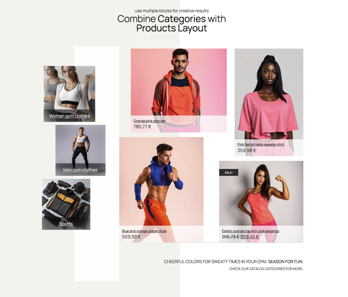
What if your product display could look like this instead?
- A hero product spanning two columns, immediately drawing attention
- Complementary items nestled alongside, sized to suggest pairing
- Sale items with overlapping badges that pop without feeling cluttered
- Different layouts per device — a dramatic desktop design that gracefully adapts to mobile

Elastic orange top with pink leggings


This isn’t a mockup requiring a developer. This is what’s possible with drag-and-drop grid layouts.
Breaking the Grid (While Keeping the Grid)
The secret is a free-form grid system. Unlike traditional column-based layouts, a free-form grid lets you:
- Drag products anywhere within the container
- Resize each item independently —make that featured product twice as tall
- Overlap elements for magazine-style compositions
- Control z-index so layered products stack correctly
Think of it as the difference between a spreadsheet and a design canvas. Both organize information—one just does it with creativity.
Real-World Applications
For Category Pages
Instead of identical thumbnails marching in formation, create **visual hierarchy**:
- Lead with your bestseller at double size
- Group related items by proximity
- Use smaller tiles for accessories that complement the main products


For Homepage Features
Your homepage isn’t a catalog—it’s a first impression. A creative product layout lets you:
- Showcase seasonal collections with intentional emphasis
- Create “shop the look” arrangements where products relate visually
- Guide the customer’s eye from high-margin items to add-ons
For Landing Pages
Campaign-specific pages deserve campaign-specific layouts:
- Sale events with overlapping “% OFF” styling
- New arrivals with featured placement
- Bundle deals where products visually “belong together”
The Technical Side (Without the Technical Headache)
Modern drag-and-drop grid systems use technology like `react-grid-layout` under the hood. But you don’t need to know that—you just need to know what it enables:
Responsive breakpoints that actually work. Design your desktop layout, then adjust tablet and mobile independently. No CSS media queries. No hoping it looks okay.
Per-item styling – That hero product can have a different background, border, or shadow than its neighbors—all from the visual editor.
Presets for speed. Start with a professionally designed layout, then customize. You’re not starting from a blank canvas unless you want to.
Save and reuse. Created a layout that works? Save it. Apply it to other pages. Share it across client projects.
What to Look For in a Visual Product Grid Solution
Not all “product grid” tools are created equal. Here’s your checklist:
| Feature | Why it matters |
|---|---|
| True drag-and-drop | Not just column selection — actual free-form positioning |
| Independent sizing | Each product should resize without affecting others |
| Responsive controls | Separate layouts per device, not just “stacking” |
| Per-item overrides | Style individual products differently within the same grid |
| Native block editor | Works with WordPress, not against it |
| No code required | If you need CSS for basic layouts, it’s not visual |
The Bottom Line
Your products aren’t identical. Your customers aren’t identical. Why should your product layouts be?
Cookie-cutter grids served their purpose when building stores was hard. Now, with modern block editors and true visual layout tools, there’s no excuse for bland product displays.
The stores that stand out are the stores that sell.
Give your products the presentation they deserve. Give your customers a browsing experience that feels intentional, not templated. Give your brand the differentiation it needs.
Because in ecommerce, being forgettable is being invisible.

Ready to break free from boring product grids?
Discover Mosaic Product Layouts :
the drag-and-drop grid system built for WooCommerce stores that refuse to blend in.


Leave a Reply