
Understanding the Need for Custom Controls for our block
When we set out to create a options control for our Mosaic Product Layouts block plugin, we faced a common challenge: the existing components for WordPress editor didn’t quite meet our needs .
We needed something that provides visual selection options in a way that was both intuitive and consistent with WordPress’s design patterns.
The core issue for us was that while WordPress offers excellent components like RadioControl for text-based options and CustomSelectControl for styled dropdowns, but neither provided the visual selection interface we wanted:
// WordPress editor components
<RadioControl
    label="Layout"
    options={[
        { label: 'Left', value: 'left' },
        // ... other options
    ]}
    onChange={handleChange}
/>
<CustomSelectControl
    label="Layout"
    options={[
        { key: 'left', name: 'Left' },
        { key: 'center', name: 'Center' }
    ]}
    onChange={handleChange}
/>
Our logic was that users often understand visual options better than text descriptions. After all, a picture is worth a thousand words. This visual approach can reduce cognitive load and improve the overall user experience.
Guidelines for creating a Custom Control
- User Experience Requirements
- Visual representation of control options, more intuitive than text-based
- Icons or images to help users understand choices better
- Reduce cognitive load compared to text descriptions
- Requirements for integration with WordPress Components
- Need to maintain consistency with WordPress UI
- Must follow WordPress accessibility standards
- Should leverage existing WordPress component patterns
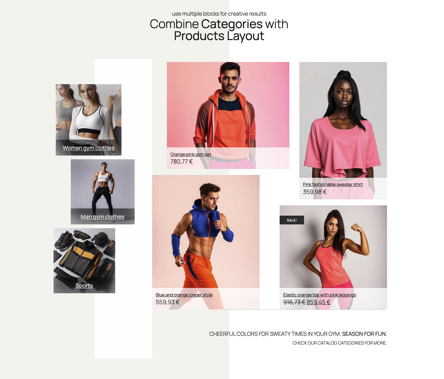
Boring product pages? No problem.
Build your beautiful product layout with the power of the Mosaic Product Layouts and WordPress Editor. No coding skills required. Only fun.
Planning the Solution
1. Identifying Required Features
- Support multiple visual element types (icons, images, SVGs)
- Follow WordPress styling patterns
- Be reusable across different blocks
2. Analyzing WordPress Components
Before building our custom control, we examined existing WordPress components – and we decided to use Button and ButtonGroup components (part of @wordpress/components package), instead of RadioControl or CustomSelectControl. Adding visual elements, like image or svg element seemed fairly straightforward.
3. Component Structure Planning
Our custom control component should have the following props: label and help (optional, but recommended), required array of options value, onChange for handling changes, and optional size prop for image/icon size.
Our component, when imported to another component, should look something like this:
// Import our custom control
import ImageRadioSelectControl from './custom-controls/ImageRadioSelectControl';
// Planned component with props
<ImageRadioSelectControl
	label={__('Horiz. align', 'mosaic-product-layouts')}
	help={__('Align product elements horizontally', 'mosaic-product-layouts')}
	options={[
		{ value: 'start', label: 'Flex start', type: 'svg', icon: icons.justifyLeft },
		{ value: 'center', label: 'Center', type: 'svg', icon: icons.justifyCenter },
		{ value: 'end', label: 'Flex end', type: 'svg', icon: icons.justifyRight },
	]}
	value={elementsAlign}
	onChange={(newValue) =>
    setAttributes({align: newValue});
	}
/>Implementation Steps
1. Base Component Structure
Since we’re going to use WordPress editor components, we need to import them, first, as well as useState and useEffect React hooks for state handling. The Icon and DashIcon are editor components with a selection of icons, and a BaseControl for label and help text.
import React from 'react';
import { Button, ButtonGroup, BaseControl, Icon, Dashicon } from '@wordpress/components';
import { useState, useEffect } from '@wordpress/element';Since we are building this component in TypeScript, we will define the main props interfaces, and set up a component frame:
type IconType = React.ComponentType<{ size?: number }>;

interface ImageRadioOption {
	value: string;
	label: string;
	type: 'svg' | 'dash' | 'image';
	icon: IconType | string;  // IconType for SVG, string for dash/image
}

// Define the main props interface
interface ImageRadioSelectControlProps {
	value: string;
	options: ImageRadioOption[];
	onChange: (value: string) => void;
	label: string;
	size?: number;
	help?: string;
}

// Implement the component with the interface.
const ImageRadioSelectControl: React.FC<ImageRadioSelectControlProps> = ({
	value,
	options,
	onChange,
	label,
	size = 24, // default value
	help
}) => {
  // This is where the component "magic" will happen :)
}2. State Management
Like any other React component, state management is essential. The planned behavior of or component elements is to change it’s visual state too, to mark the active, or selected option. The activeOption property will be used only internally by the component, so using useState and useEffect hooks will do the trick.
To change the actual option as a state main property, we set a handleClick method.
const [activeOption, setActiveOption] = useState<string>(value);

const handleClick = (optionValue: string): void => {
	setActiveOption(optionValue);
	onChange(optionValue);
};

useEffect(() => {
	setActiveOption(value);
}, [value]);3. Rendering icon
Components available from the WordPress components package are Icon and Dashicon. The Icon component requires the icon prop to be an SVG.
The Dashicon accepts a string. This string defines which character from the Dashicon font will be used. The string format for Dashicons is 'dashicon-[icon name]' (more about that here), but for usage with Dashicon component, only 'icon-name' is expected.
Here’s the function for rendering icons, depending on option.type used:
// Render icon, as Icon (SVG), Dashicon (string) components, or image (string).
const renderIcon = (option: ImageRadioOption): React.ReactNode => {
	switch (option.type) {
		case 'svg':
			return <Icon icon={option.icon} size={size} />;
		case 'dash':
			return <Dashicon icon={option.icon as any} size={size} />;
		case 'image':
			return <img src={option.icon} alt={option.label} style={{ height: `${size}px` }} />;
		default:
			return null;
	}
};4. Final component JSX
return (
		<BaseControl label={label} help={help}>
			<ButtonGroup>
				{options.map((option: ImageRadioOption) => (
					<Button
						key={option.value}
						variant={activeOption === option.value ? 'primary' : undefined}
						onClick={() => handleClick(option.value)}
						className='mosaic-product-layouts__image-radio-select-control'
					>
						{renderIcon(option)}
					</Button>
				))}
			</ButtonGroup>
		</BaseControl>
);Finally, icons will be rendered by mapping options as Button components, wrapped in BaseControl component for optional label and help text, ButtonsGroup components for stacking buttons.
The onClick event will update option.value, and the active value will be visually marked by using component state activeOption property and a ‘variant’ Button prop.
Usage Examples
Usage with Icon component
The ‘icon’ prop in Icon component requires svg, so for this example, we imported WordPress icons, used by the editor, as it contains svg images we can use.
// Import components for sidebar InspectorControls.
import { InspectorControls } from "@wordpress/block-editor";
import { PanelBody } from "@wordpress/components";
import { justifyLeft, justifyCenter, justifyRight, justifyTop, justifyCenterVertical, justifyBottom } from '@wordpress/icons';
// Import our custom control
import ImageRadioSelectControl from './custom-controls/ImageRadioSelectControl';

<InspectorControls>
  <PanelBody>
    <ImageRadioSelectControl
        label="Horizontal Alignment" // Optional.
        help="align element horizontally" // Optional.
        value={attributes.align}
        options={[
            { value: 'start', label: 'Left', type: 'svg', icon: justifyLeft },
            { value: 'center', label: 'Center', type: 'svg', icon: justifyCenter },
            { value: 'end', label: 'Right', type: 'svg', icon: justifyRight },
        ]}
        onChange={(newValue) => setAttributes({ align: newValue })}
        size={24} // Optional.
    />
  </PanelBody>
  {/* ... block control for Vertical Alignment */}
  {/* ... used justifyTop, justifyCenterVertical, justifyBottom icons */}
<InspectorControls>
Usage with Dashicon component
// Import components for sidebar InspectorControls.
import { InspectorControls } from "@wordpress/block-editor";
import { PanelBody } from "@wordpress/components";
// Import our custom control
import ImageRadioSelectControl from './custom-controls/ImageRadioSelectControl';

<InspectorControls>
  <PanelBody>
    <ImageRadioSelectControl
        label="Horizontal Alignment" // Optional.
        help="align element horizontally" // Optional.
        value={attributes.align}
        options={[
            { value: 'start', label: 'Left', type: 'dash', icon: 'align-left' },
            { value: 'center', label: 'Center', type: 'dash', icon: 'align-center'  },
            { value: 'end', label: 'Right', type: 'dash', icon: 'align-right' },
        ]}
        onChange={(newValue) => setAttributes({ align: newValue })}
        size={24} // Optional.
    />
  </PanelBody>
  {/* ... your other block controls */}
</InspectorControls>With Custom Images
// Import components for sidebar InspectorControls.
import { InspectorControls } from "@wordpress/block-editor";
import { PanelBody } from "@wordpress/components";
// Import our custom control
import ImageRadioSelectControl from './custom-controls/ImageRadioSelectControl';

<InspectorControls>
  <PanelBody>
    <ImageRadioSelectControl
        label="Layout Style" // Optional.
        help="align element horizontally" // Optional.
        value={attributes.layout}
        options={[
            { value: 'grid', label: 'Grid Layout', type: 'image', icon: '/path/to/grid-icon.png' },
            { value: 'list', label: 'List Layout', type: 'image', icon:'/path/to/list-icon.png' }
        ]}
        onChange={(newValue) => setAttributes({ layout: newValue })}
        size={24} // Optional.
    />
  </PanelBody>
  {/* ... your other block controls */}
</InspectorControls>Icon type can certainly be changed for each option. However, doing so might not be a great idea due to the need for visual consistency.
And, of course, we will sprinkle some CSS on top of our component to tweak the visuals. This CSS can be added to your block’s editor.scss file:
.mosaic-product-layouts__image-radio-select-control {
	width: auto;
	height: auto;
	margin: 2px;
	padding: 0.2em;
	justify-content: center;
	align-items: center;

	.components-button-group & {
		box-shadow: none;
		border: none;
	}
	&:not(.is-primary) {
		background-color: rgba(150, 150, 150, 0.25);
	}
	svg {
		height: auto;
		width:auto;
	}
}Conclusion
The end result was a component that met our immediate needs. It also proved to be flexible enough for various use cases. The component provides a consistent and intuitive interface for selecting layout options. It is also used for choosing visual styles or picking between different display modes. This makes it feel right at home in the WordPress block editor.
What makes this component particularly valuable is how it bridges the gap between functionality and user experience. It takes the familiar concept of radio buttons and elevates it with visual elements, making it easier for users to make informed choices while maintaining the reliability and consistency that WordPress users expect.
Creating custom controls for the WordPress block editor requires careful planning and understanding of existing components. Our ImageRadioSelectControl demonstrates how to extend WordPress’s component library while maintaining consistency with WordPress ecosytem.
Copy the whole component code from this Gist


Leave a Reply